
VISUAL SEARCH; MOBILE WEB
Lowe's Visual Search was part of a three-fold search bar — text search, image search, and barcode search. We also started preparing a fourth element — voice search.

Lowe's apps launched Visual Search a year before we started designing the mobile web version. We used a combination of app data and new research on customers who preferred to avoid downloading the app to understand customers' problems and how they wanted to solve them using Visual Search.
This project had substantial technical constraints. Collaborating daily with the engineering team helped me grow more comfortable working through project uncertainties and implementing innovative UX wins that elevated the experience. I lead content and research teams through validation and usability testing throughout the project.
The result?
2X conversions compared to the app
Some ways I did it:
- I advocated using our existing design system to prioritize where we invested our collective time.
- I addressed mobile web user's security concerns by implementing more transparent overall security permissions and messaging for customers as they allow access to their device's camera early on.
- I provided UX leadership and guidance to balance approving new releases to start seeing revenue with critical usability fixes that also needed to happen.
Some questions I needed to answer:
What ratio of Lowe's customers generally use apps vs. mobile web, and why? What relevant findings do we have on Lowe's Visual Search usage from the apps team?
What are people currently using Lowe's visual search for? Where are they using it? (In-store, at home, on the go, etc?)
How is our accuracy?
How many people scan barcodes and search by taking photos vs. uploading photos from their machines?
What technical issues and constraints does our technology have, and what unique limitations will we have for mobile web that we don't have for apps?
How are Lowe's DIY customers using Visual search vs. "Lowe's Pros" (contractor and other professionals?)
What product categories, if any, are people using Visual Search for the most? (Where do they find it most valuable)
What is the Product team's long-term vision for Visual search?
What are business expectations around the feature and timeline?
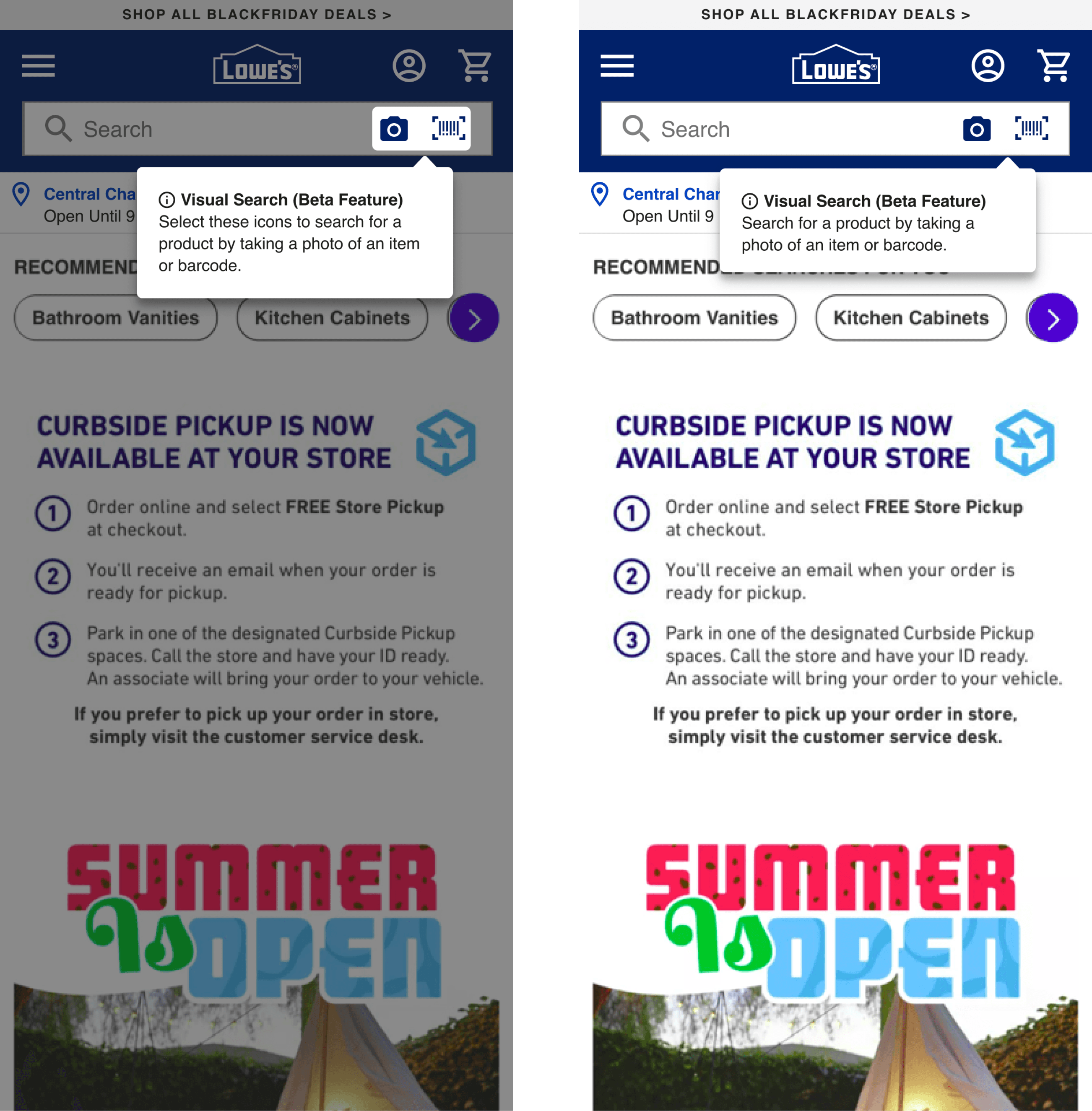
The search bar — entry to Visual Search

Entry to Visual search can start anywhere on Lowes.com from the masthead and search bar. Access can also happen via Google searches or marketing e-mails.
Understanding current customer awareness of visual search for retail products played a crucial role in testing versions of the barcode and image icons visible inside vs. outside the search bar.
RETAIL CONVERSATIONAL DESIGN
I had been working to drive the tone of Lowes' copy across the site to mimic a human, 'in-store' conversation with a red vest associate.
That said, there's always a balance between 'getting to the point quickly' and designing a digital e-commerce conversation, especially one mainly used on a mobile screen. So we landed on consolidating the search text to a recognizable "Search" on mobile and tablet and keeping "What are you looking for today?" on laptop and desktop views.
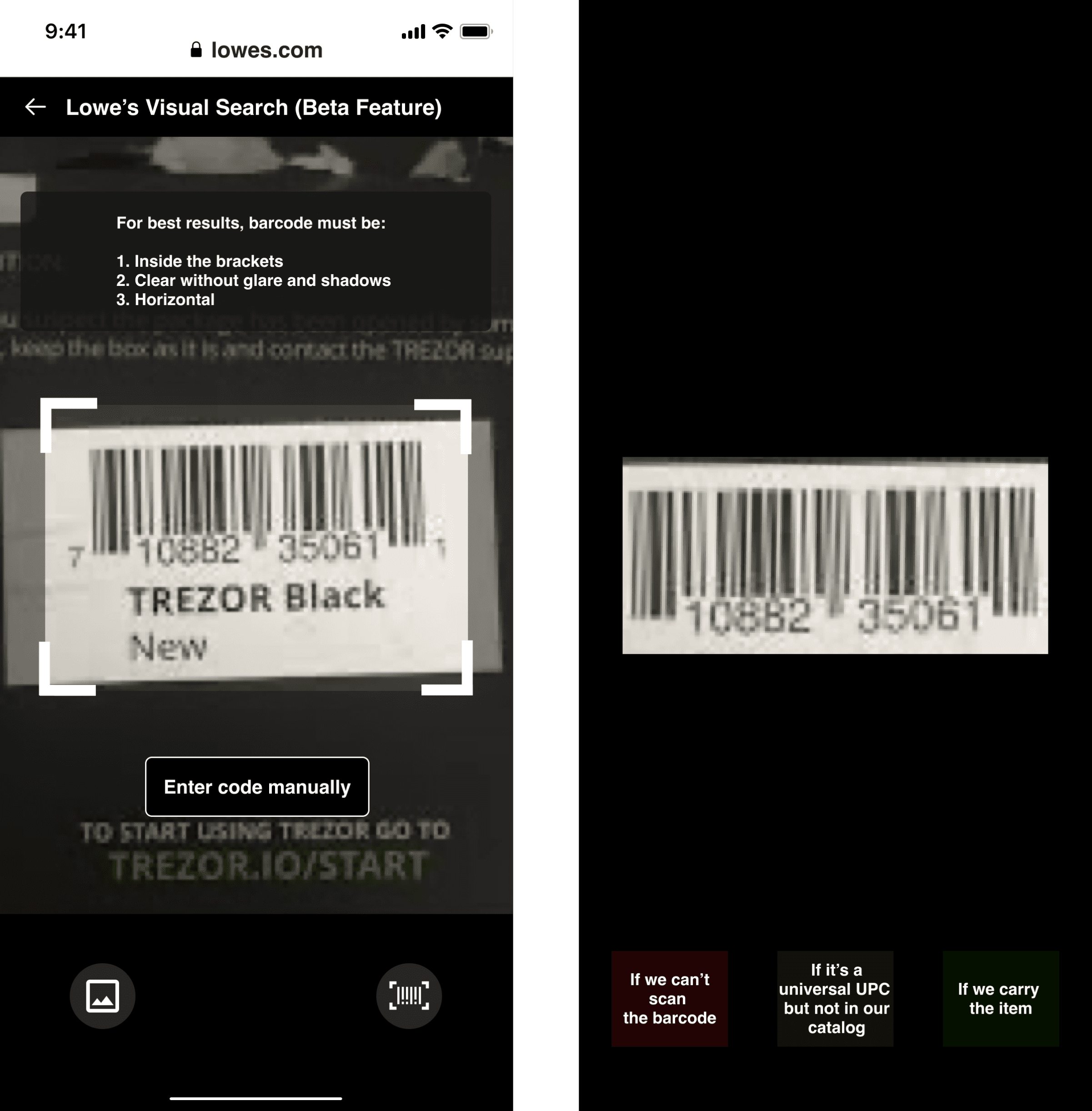
Barcode Search
At the time of this design cycle, the current power users for barcode scanning were:
Lowe's employees — in-store
Lowe's customers — in-store
PRO users — contractors, etc. They are using barcode search largely when reordering their go-to items.
When customers click the 'scan barcode' icon inside the search bar, they're taken directly to the scan barcode experience.
They can then move between image search and back to barcode search as needed. The system scan happens as soon as it recognizes a barcode.
If customers know in advance that a barcode won't be scannable (maybe it's partially ripped off or colored on), they can enter the code manually.
Setting customers up for success when our tech fails:
What happens when a customer tries to scan a barcode but our tech can't pick it up?
Customers get frustrated when things don't work. To mitigate frustration, I offered context and transparency about why things weren't working, logical next steps, and easy ways out/back.
We suggest better lighting or moving closer to the barcode, then a "Try again" CTA.
We also offer customers the option to enter their code manually instead of scanning it.
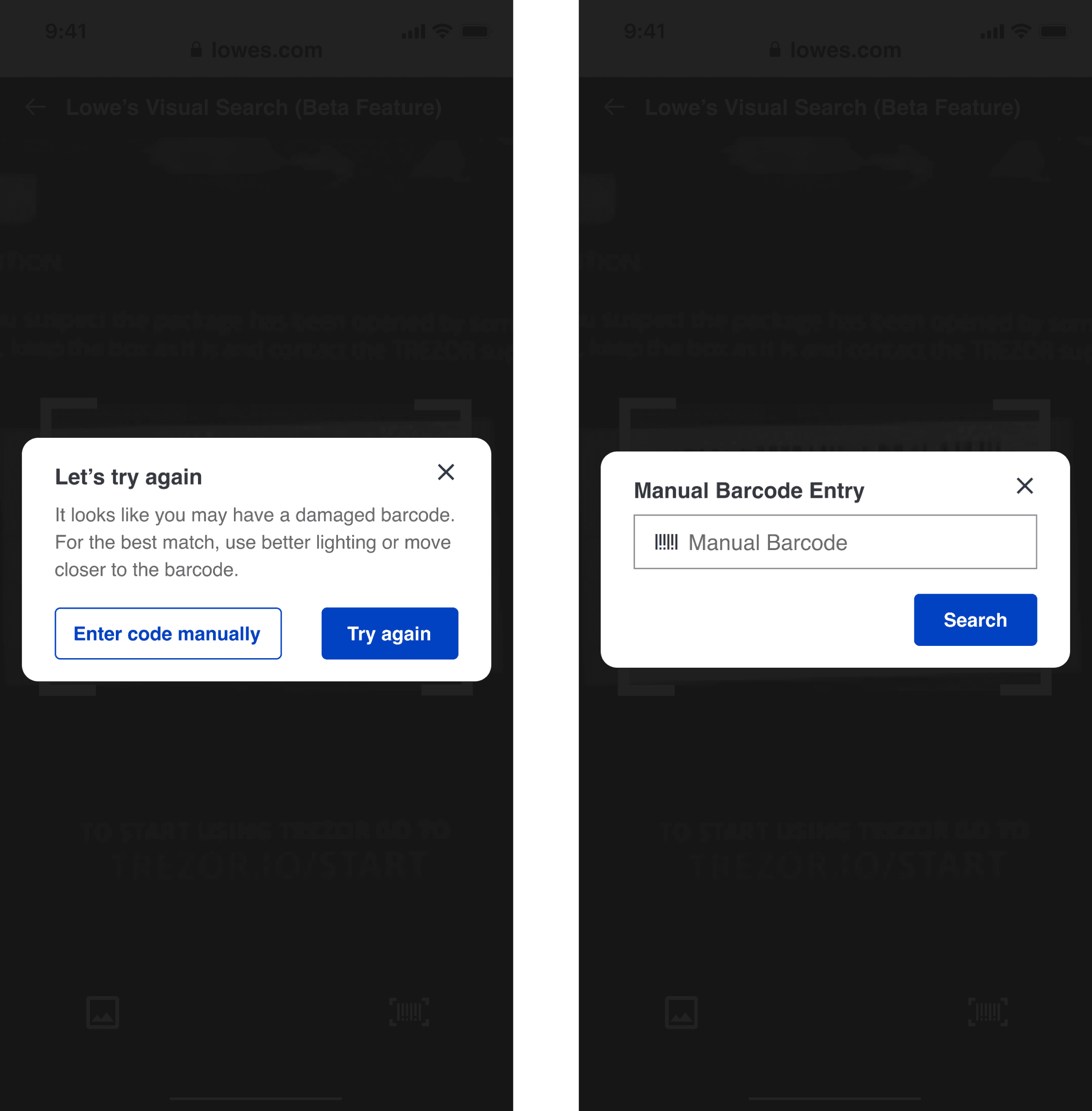
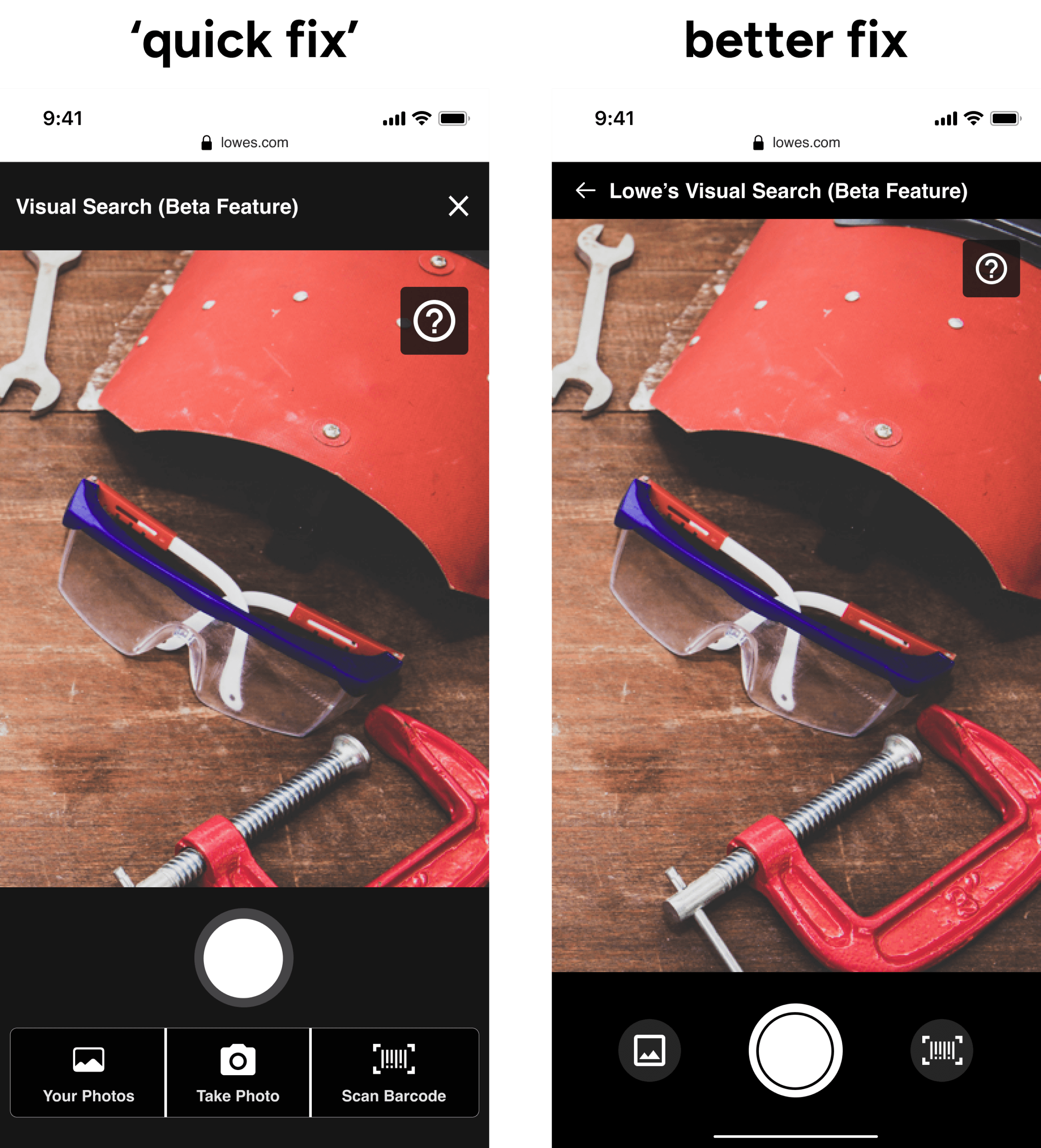
Version A above was a "quick fix" that we implemented for the Beta experience.
🚨 During usability testing, Version A was the point that 90% of customers were most likely to leave Lowes.com to search for their item at a competitor site.
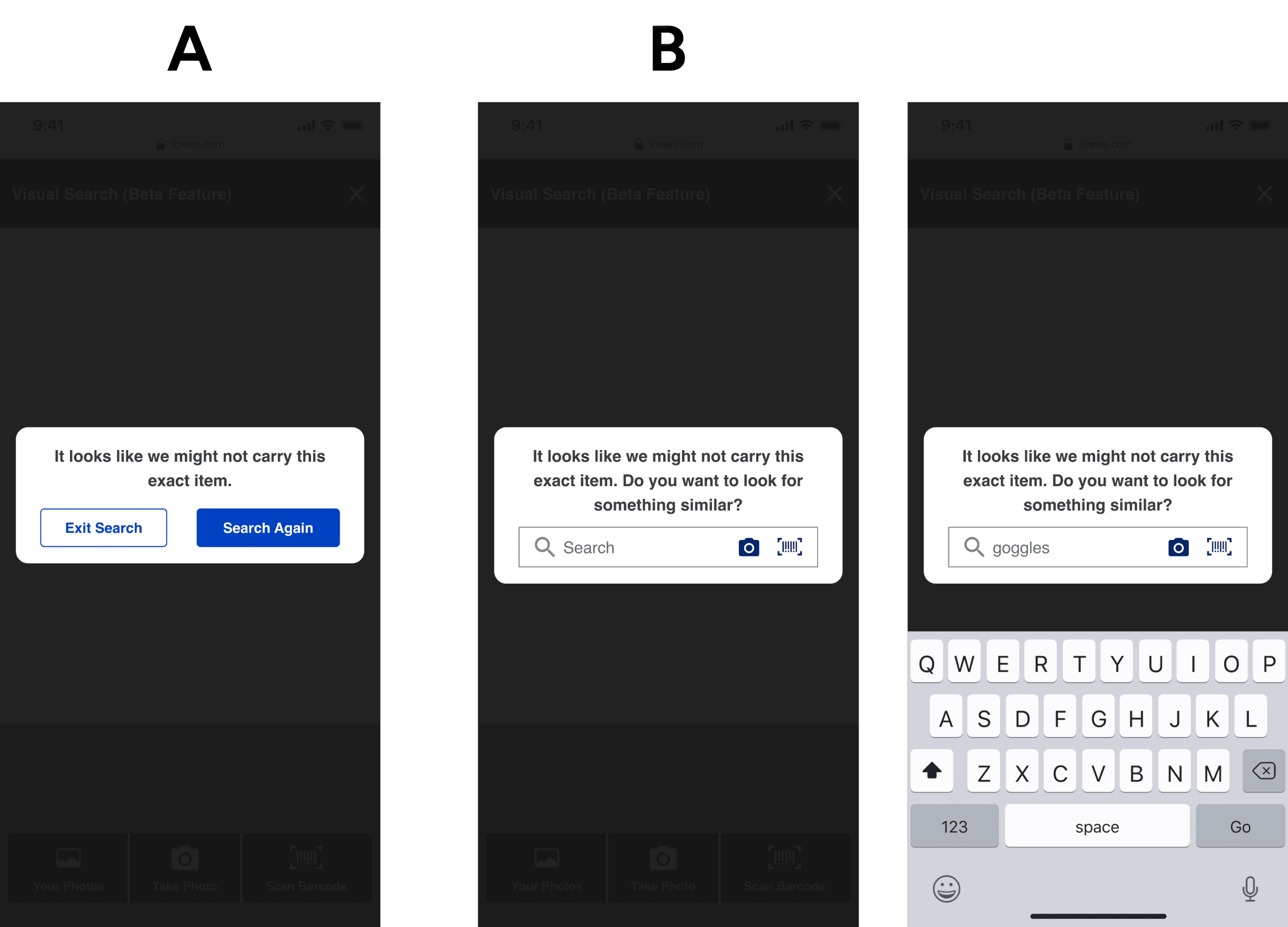
So at the same time, I continuously advocated for the technical bandwidth of integrating an easily accessible search bar, as shown above in version B.
Version B offers a more conversational and transparent way of providing customers easy access to text-to-search to look for a similar item.
The integrated search bar tested very well during a follow-up usability test — almost 100% of customers tried to use it as a next step to search for an alternate product.
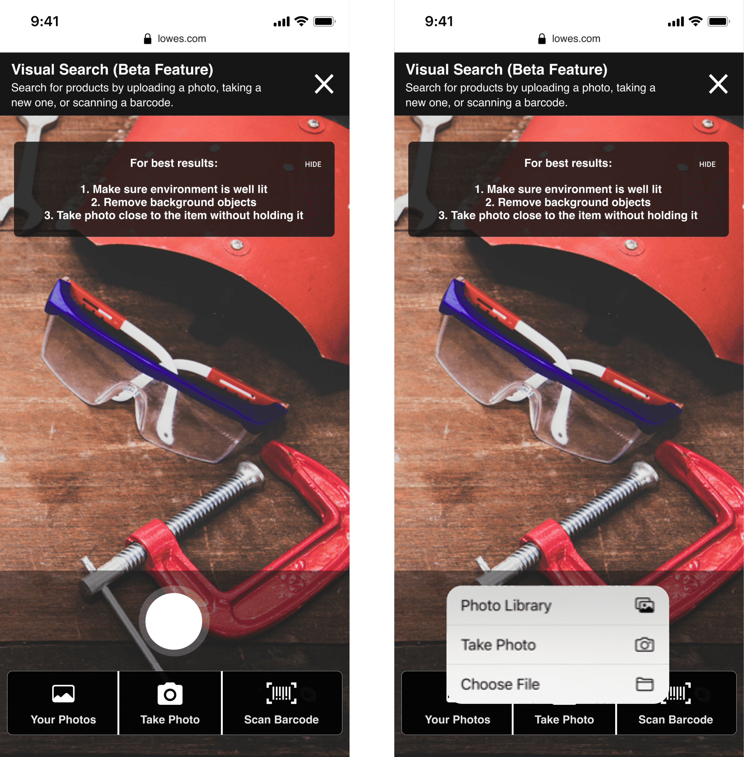
Image search - customer security concerns:
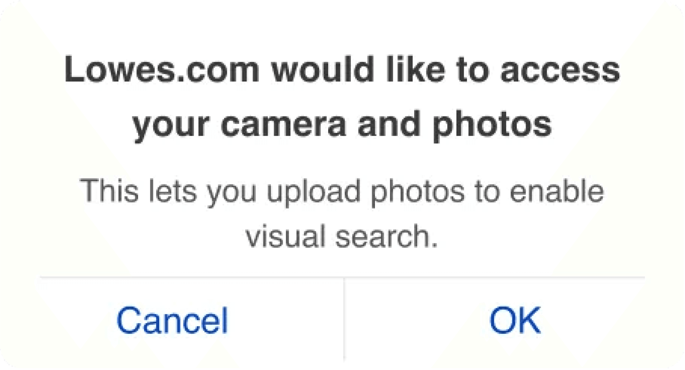
Lowe's customers shared with us that they're increasingly weary of allowing access to their devices. We needed customized messaging that offered transparency on why we needed their permissions for visual search.
21 of the 30 people we tested the new messaging on found the camera permissions request completely trustworthy and expected it before using the feature the first time. The other nine people found the request trustworthy but were still apprehensive when giving a new app or website access to their phone and personal information.
🗣️ "This is something I would expect to see if I've never used my camera on the particular site before, for privacy reasons. I guess I'm glad to see it. I have no problems granting access in this case because I understand I need my camera to be able to search."
🗣️ "It's what we generally expect using anything like Google Lens or taking a picture to do something like that. It always asks permission to use cameras when we're doing that. So, I think it's totally trustworthy."
Fixing technical constraints late in the process
We chose the "quick fix" version below to accommodate our tight incremental release schedule so customers wouldn't need to take a picture twice.
Then, I worked with our Product Manager and Lead Engineer to prioritize new releases vs. fixes. We all worked together and compromised. When our PM wanted to add a tooltip underneath the search bar to attract more usage to Visual search, we asked that we implement the better fix on the right above ⬆️ first. It was still far from perfect, but better than we had.
I didn't want to approve onboarding more Lowe's customers to a new but broken experience. I also expanded the viewport by improving our header. Instead of 'closing' Visual Search, we are moving customers' back' wherever they were on the lowes.com site before they entered Visual Search.
Introducing Visual Search to customers
These are some design/writing versions of the tooltip. We decided against version A because the homepage is a tricky area, and we weren't sure about the value of visual search to mobile web customers.
Custom image cropping tool
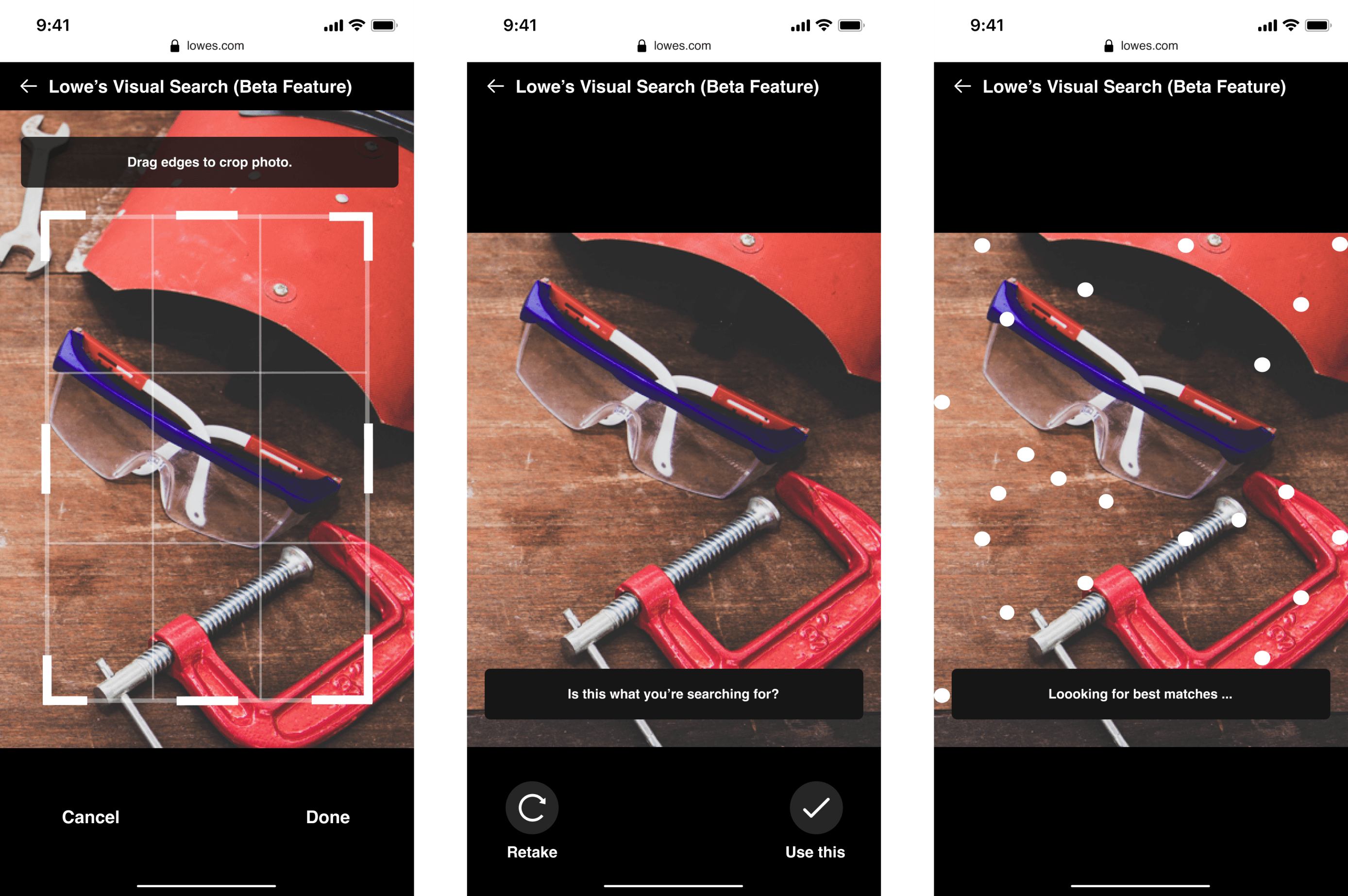
Custom image cropping tool
I added six touchpoints to the cropping tool to be super easy and intuitive to use and give customers maximum control to customize the image they want to use to search. (We had plans for automatic image detection, but this is what we're using in the interim.)
After a customer uses the cropping tool, we show them their result so they can choose whether to use it, "retake" their picture, or "redo" an uploaded image.
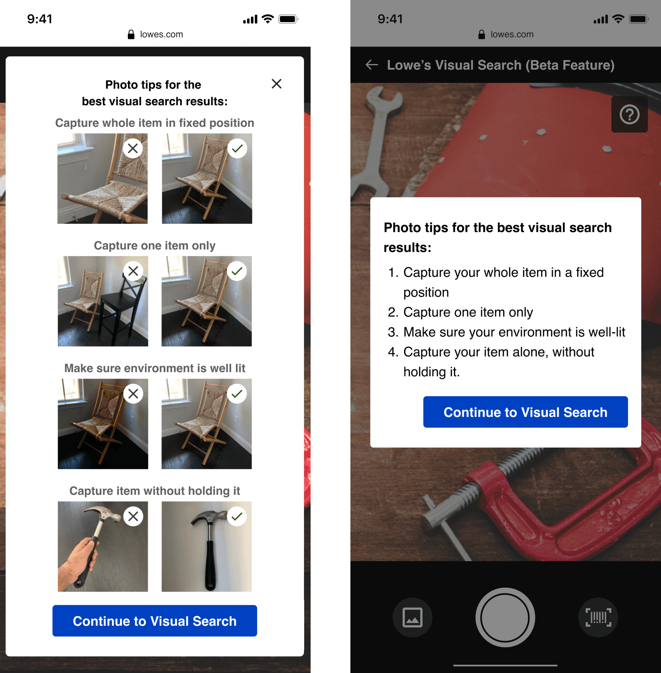
Setting customers up for success - ‘Relevancy’ tips
The photo tips on the screens above are based on the thousands of real customer images we parsed through to see what images aren't making it through and how people could take pictures that would improve our capability to get them more relevant results.
Our tech is imperfect, and we don't want customers to think they're at fault when we can't show them relevant results.
After a customer takes a picture and while we "are looking for best matches," our system can recognize if we can offer results better than 60% relevancy. When we can't, we wanted to show helpful tips for taking a better picture.
We alternated between showing this screen on people's first entry to Visual search or only after we analyzed their photos. The first option (with examples of images) was something we used for V1 of Visual Search for education purposes. V2 was an improvement — offering more accessible ways for customers to click out and access their intended task.
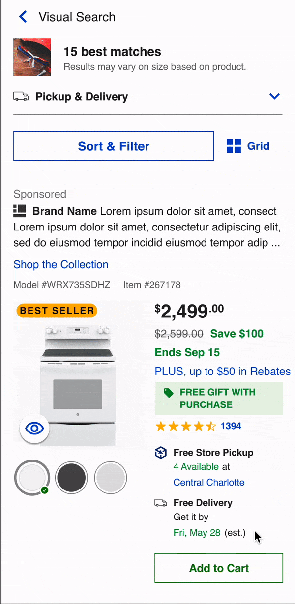
Search results text customized for different product categories.
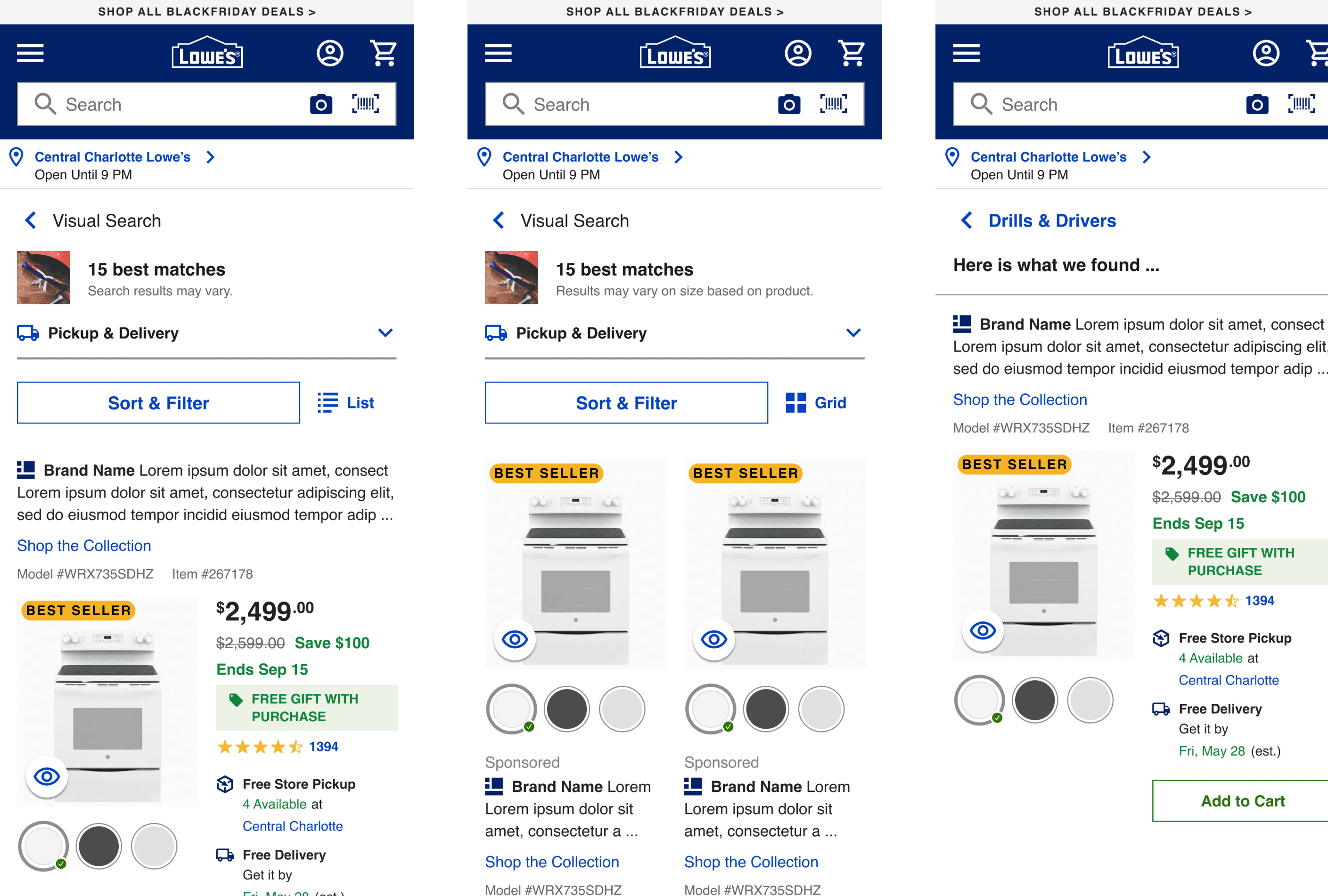
Our technology couldn't yet accurately analyze size-specific home improvement products like nails and bolts. (Details critical to these items)
I worked with our UX writing team on creating custom messaging for the results of those products — "Results may vary on size based on product" and something that works for any other general inaccuracy for different categories— "Search results may vary."
SKU Search will only return one result, so the message is straightforward. "Here is what we found..."
The feedback component
How can we get genuine customer feedback without too much intrusion into a customer's mobile shopping experience?
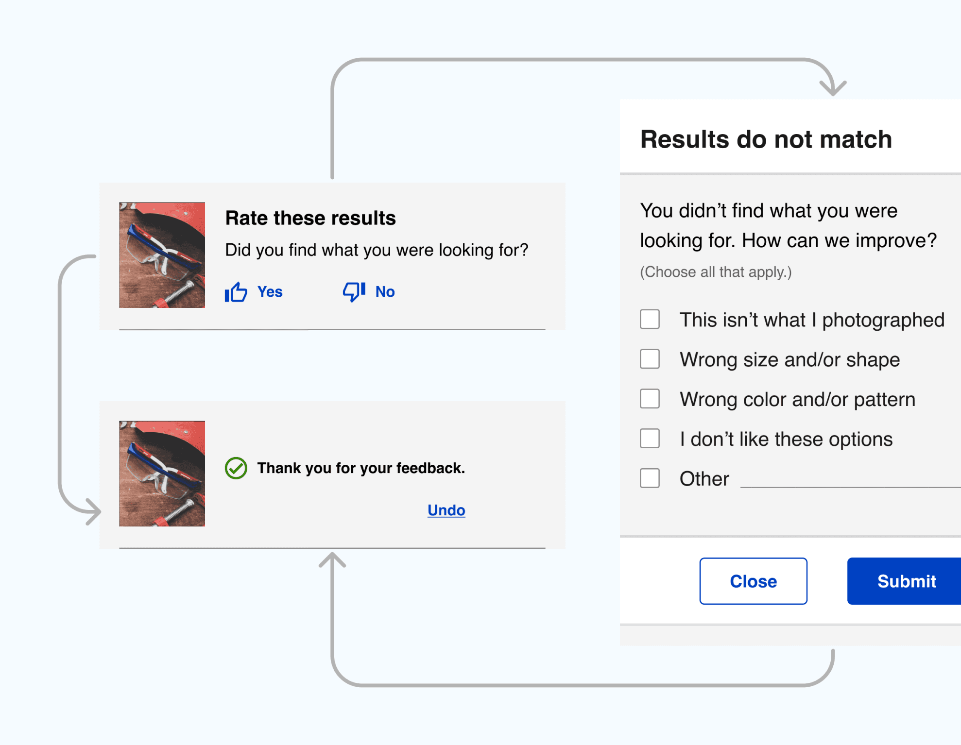
Lowe's heavily relies on customer feedback and constantly monitors for bugs and improvements. One of the ways we do this is through a service called Medallia, which has its technical requirements and constraints. And while we need this feedback, we don't want it to intrude on a customer's experience.
When considering placement for the feedback component, we needed to evaluate how many products customers need to see before they know if they're getting relevant results for their search.
After testing Visual search for multiple categories, we learned that people usually know whether we have what they are looking for after the first two or three results on mobile. They aren't scrolling much farther than that.
There was a technical issue around the "undo" button on the "Thank you for your feedback" message. After a customer clicks on either "yes" or "no" inside the feedback component, that message is sent to Medallia's system, and there is no way for us to call it back. So technically, we can't make "undo" work.
I added it anyway, even if it doesn't work. Customers WILL inevitably click on a "yes or no" when they mistakenly on a small mobile screen. I didn't want them to feel frustrated that they may have sent feedback that doesn't best represent their experience using our product.
Custom error messages for image recognition software
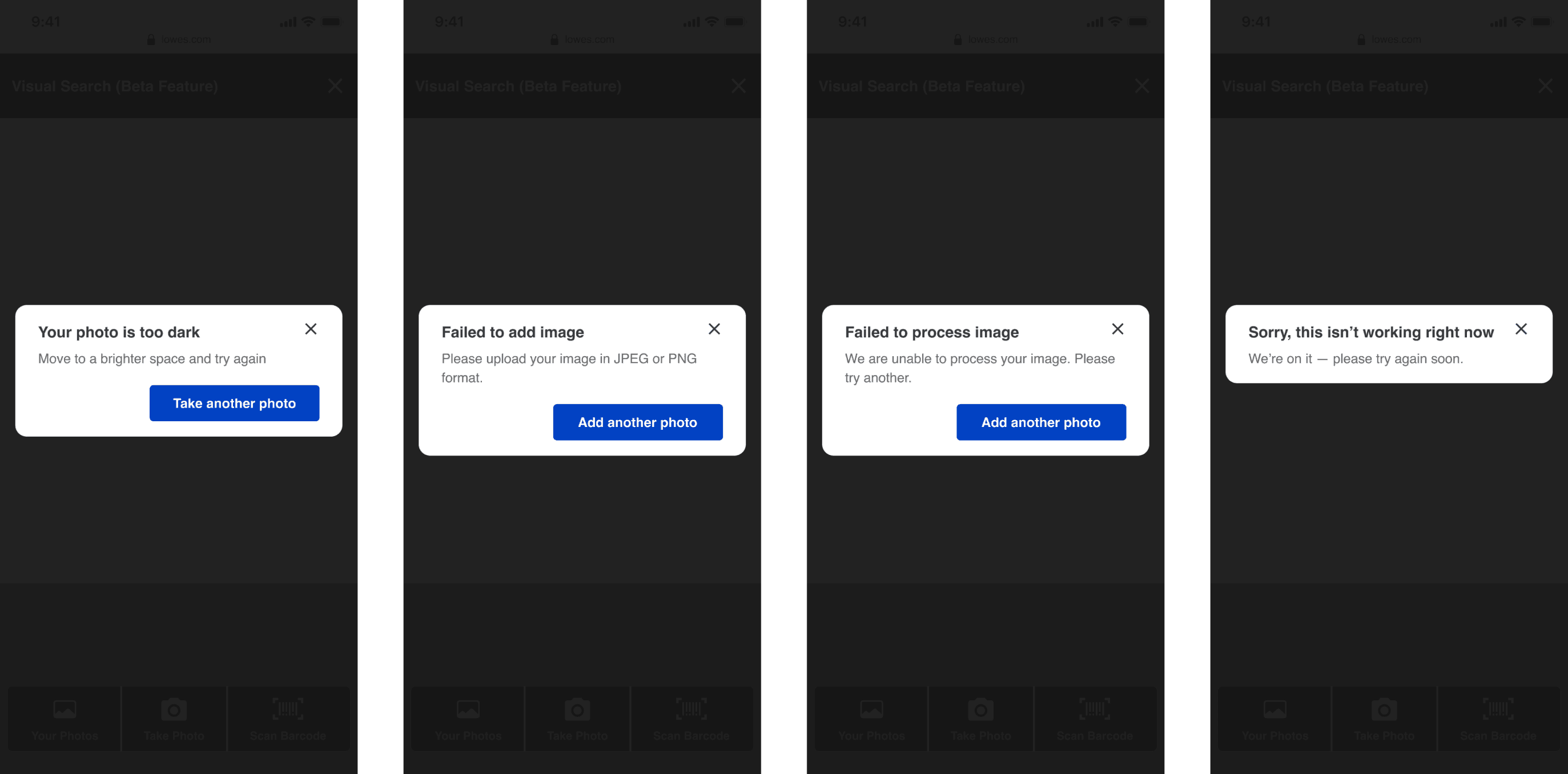
Custom error messages evolved as we could start learning why we couldn't analyze a person's image. That knowledge also changed where and when we showed the relevancy screen.
The more we can understand what is causing an error and customize the error message and corresponding action to fix it, the faster and better people can complete their tasks. "Little" things like this build a more trusting relationship between a brand and its customers.
Unified barcode icon
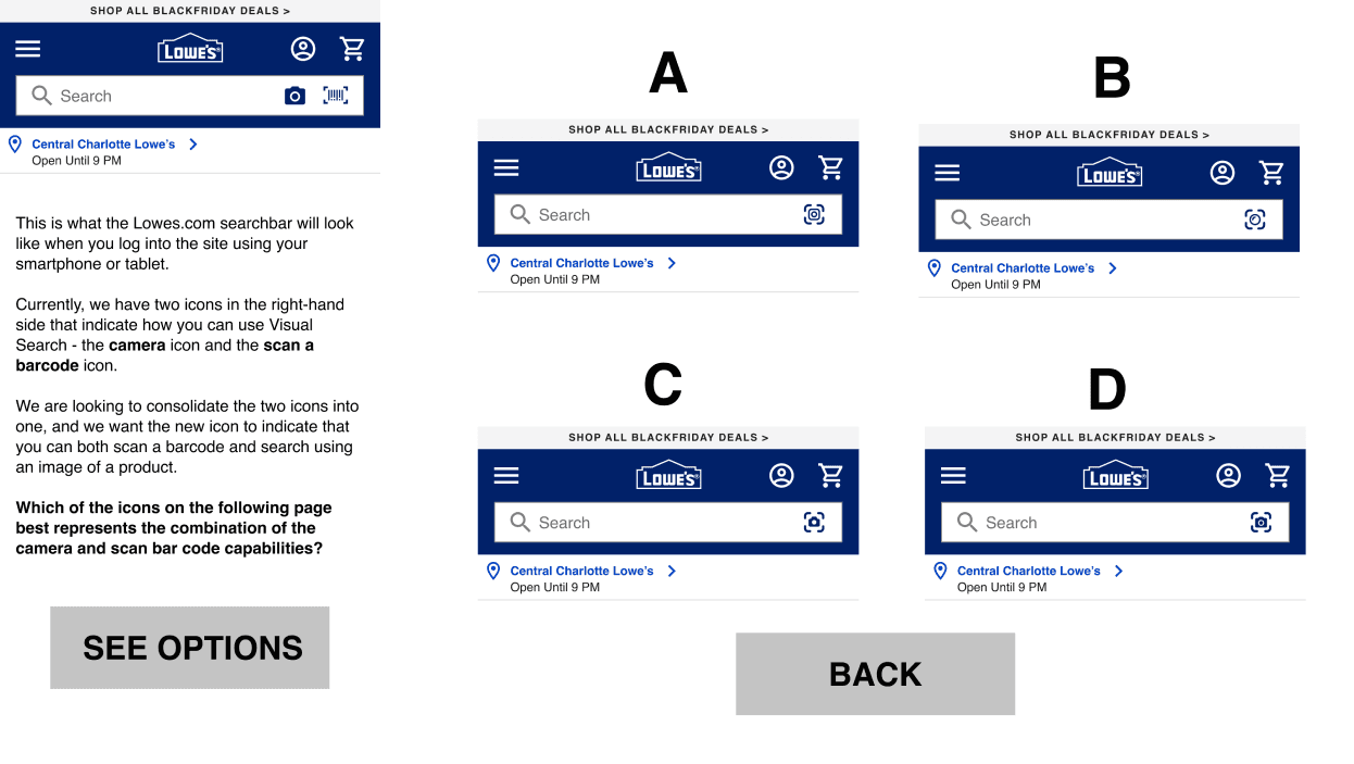
To achieve brand and action icon consistency, we worked in unison with the app team throughout Visual Search, even though their design system and patterns are very different from the web team’s.
Visual Search; Tablet

The next addition to visual search will be QR codes. The product team identified this because customers already use image search to take pictures of QR codes. That's how they expect QR search to work — based on learned behavior and design patterns in other digital products our customers use daily.
My last contribution to this project at Lowe's was integrating UX strategy and prioritization for Visual Search. In measuring the value to customers based on all we know, I didn't see QR code scanning needing additional UX work. If people already use image search for QR codes, let's build that capability technically and meet their expectations. In the meantime, we can prioritize other things for visual search — like merging image and barcode search into one collective experience.
More projects


Let's work together! 🚀