Visualizers - Flooring, Paint, and a Future ‘Home Design Center’
One of the biggest challenges e-commerce businesses have is helping their customers buy their products online with confidence without being able to see, touch, or otherwise experience them in the tangible world.
Lowe’s Flooring and Paint Visualizers are both key initiatives in Lowe’s Omniverse / Spatial Commerce program. The Lowe’s Visualizer is a branded, custom-built experience that allows customers to see how flooring and other home improvement products will look in their room before ordering them.
While designing the next generation of Lowe's Visualizers, I led and constantly interfaced with a myriad of multi-disciplinary design and cross-functional teams to add exciting and helpful functionality that supports a clean user experience.
The result?
➡️ +50% conversion rate
➡️ +.5MM weekly revenue
➡️ +100% revenue per visit
➡️ 60% ATC rate
➡️ An customer-centric end product that will scale with fast-moving current technology to capabilities we're envisioning for the future.
V1 of Lowe's Visualizer utilized a partially customizable third-party product used by most home improvement e-tailers, including Home Depot.
My vision for the new generation Visualizer was to design a product that stands independently but integrates seamlessly with Lowe's website.
In action

Some things I did:
Designed multiple new functionalities for Visualizer from 0–1, like the capability for customers to upload an image of their own room instead of seeing their flooring choices in Lowe's templated rooms.
Designed the capability for customers to compare flooring by viewing two different flooring choices side-by-side.
Integrated 'Paint and Grout Visualizers' into 'Flooring Visualizer.' This laid the groundwork in prepping Visualizer to become an all-encompassing "design center" for the home.
Added 360° rotation for viewing products in rooms.
Wrote and rewrote CTA's and labels for Visualizer to support a seamless experience and help customers immediately understand the functionality, measuring and sizing, and 'Add to Cart" process.
Identified UX opportunities to increase conversions into 'Visualizer' from our product and search listing pages.
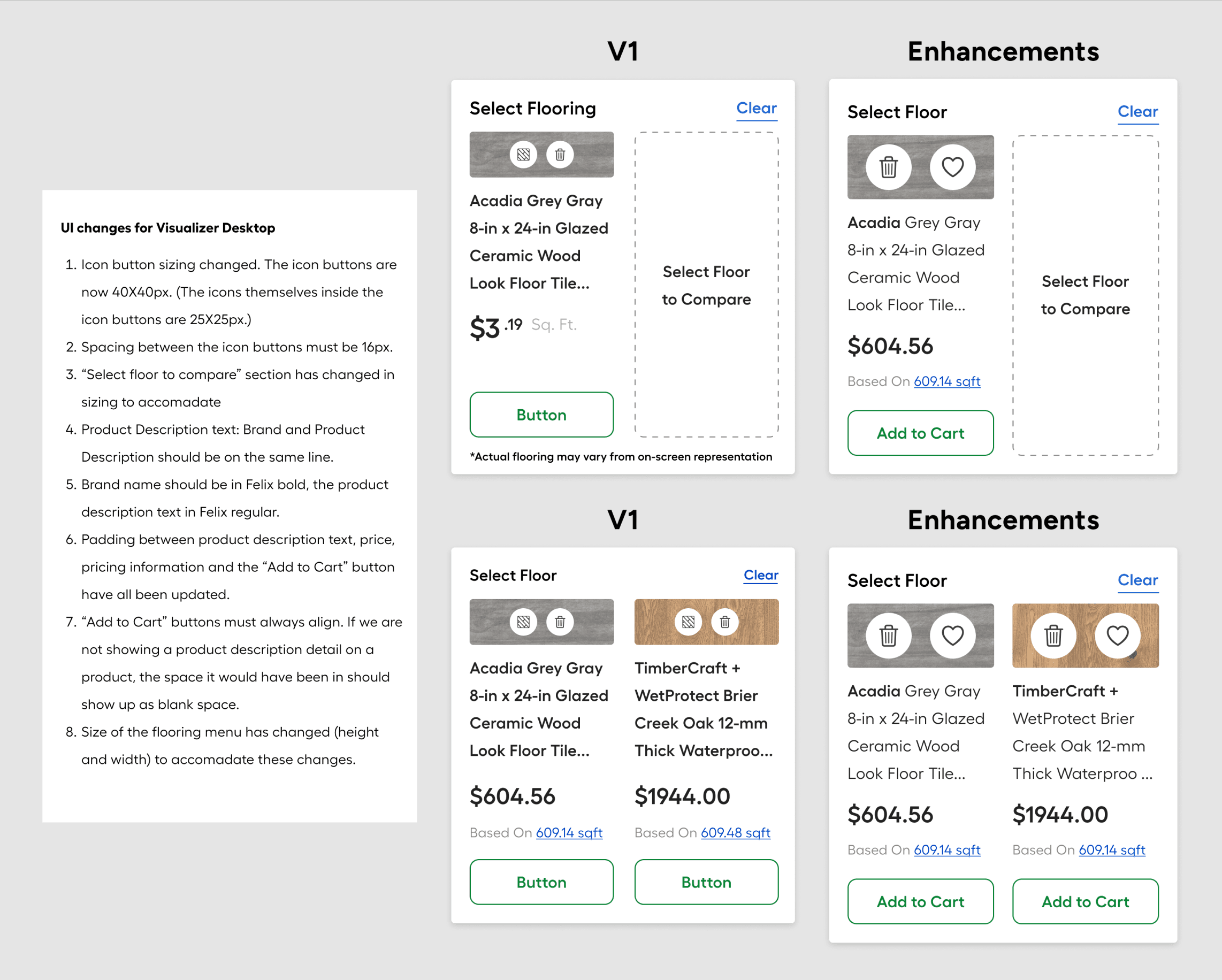
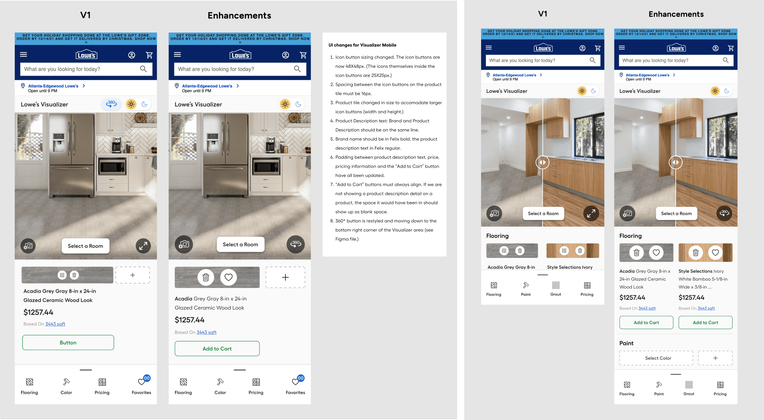
Championed accessibility by revamping design assets (Colors, touch point sizes, spacing, overall visual hierarchy, etc) and prioritizing those fixes during subsequential feature releases.
Translated inherited design concepts to components in our existing design system, created new ones as necessary, and persistently followed up on their approval timelines with the Design Systems team.
Supported engineers daily, performed usability QA, drove research and content, and worked on UX strategy with our PM and Product Leaders to plan future initiatives and prioritize releases vs. UX fixes in the now.
Different customer intents and mindsets to consider for an integrated Paint / Flooring Visualizer:
Customers who are:
Interested in buying flooring only
Intent on buying flooring, but want to explore paint as well
Interested in purchasing both paint and flooring
Interested in purchasing paint only
Came to buy paint, but want to explore flooring as well
Mobile entry via a Flooring product
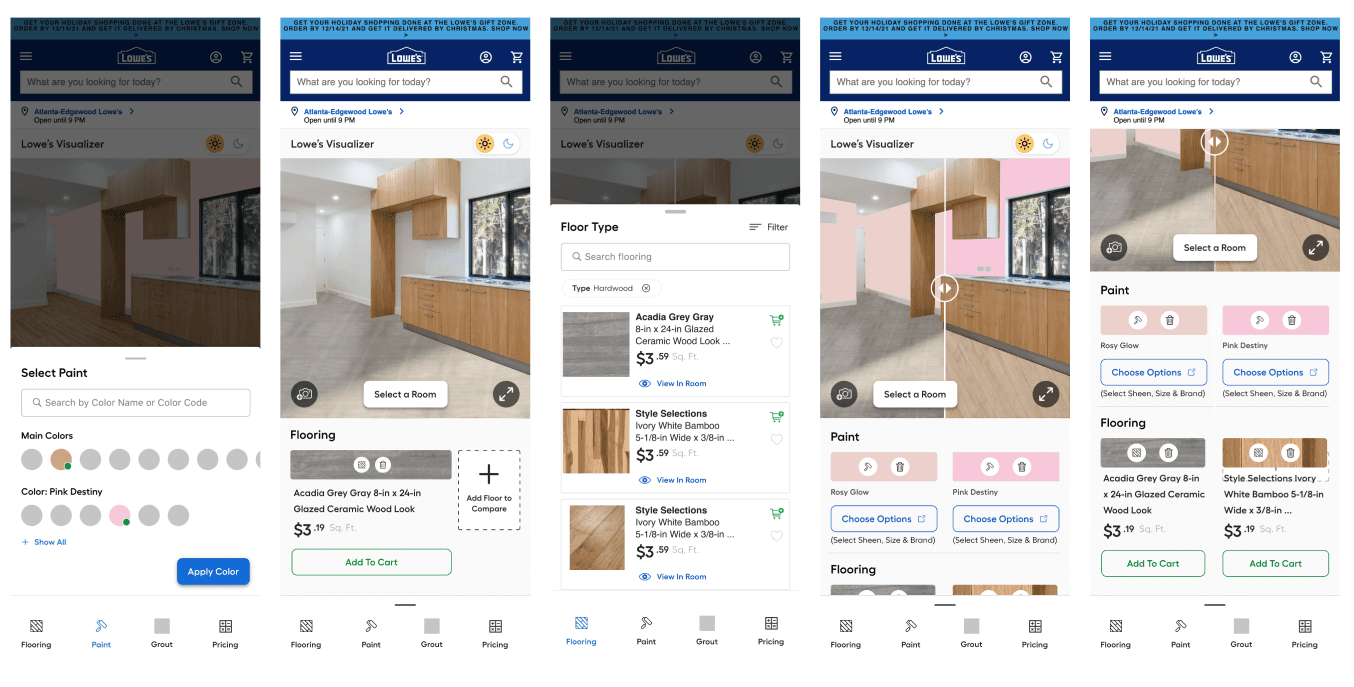
Mobile entry via a paint product

The vision

Lowe's customers love to open multiple windows when shopping on product pages to compare products. I translated that shopping behavior and customer preference by envisioning a space where customers can save and share their work differently.
My intention for 'Pros,' or building/home design professional customers with this design, was to allow them to strengthen their relationship with their clients by sharing different options easily -- an 'educated assumption' based on testing adjacent features.
In my Visualizer concept, functions that directly manipulate the room image are moved on the image to improve usability by strengthening customers' association between these icons and what they do.

The buy flow: The ATC button needs to be easily accessible for customers that are selecting multiple product options.
Concept 1

⬆️ Thinking ahead to a design center, I thought about adding a carousel of products a person is currently viewing in their room to select and add all to the cart. This concept would be an additional opportunity to add products to a cart without interacting with each category in the menu.
Concept 2

This exploration highlighted the Product's interactivity, but it wouldn’t scale well once we had many products inside Visualizer.
Concept 3
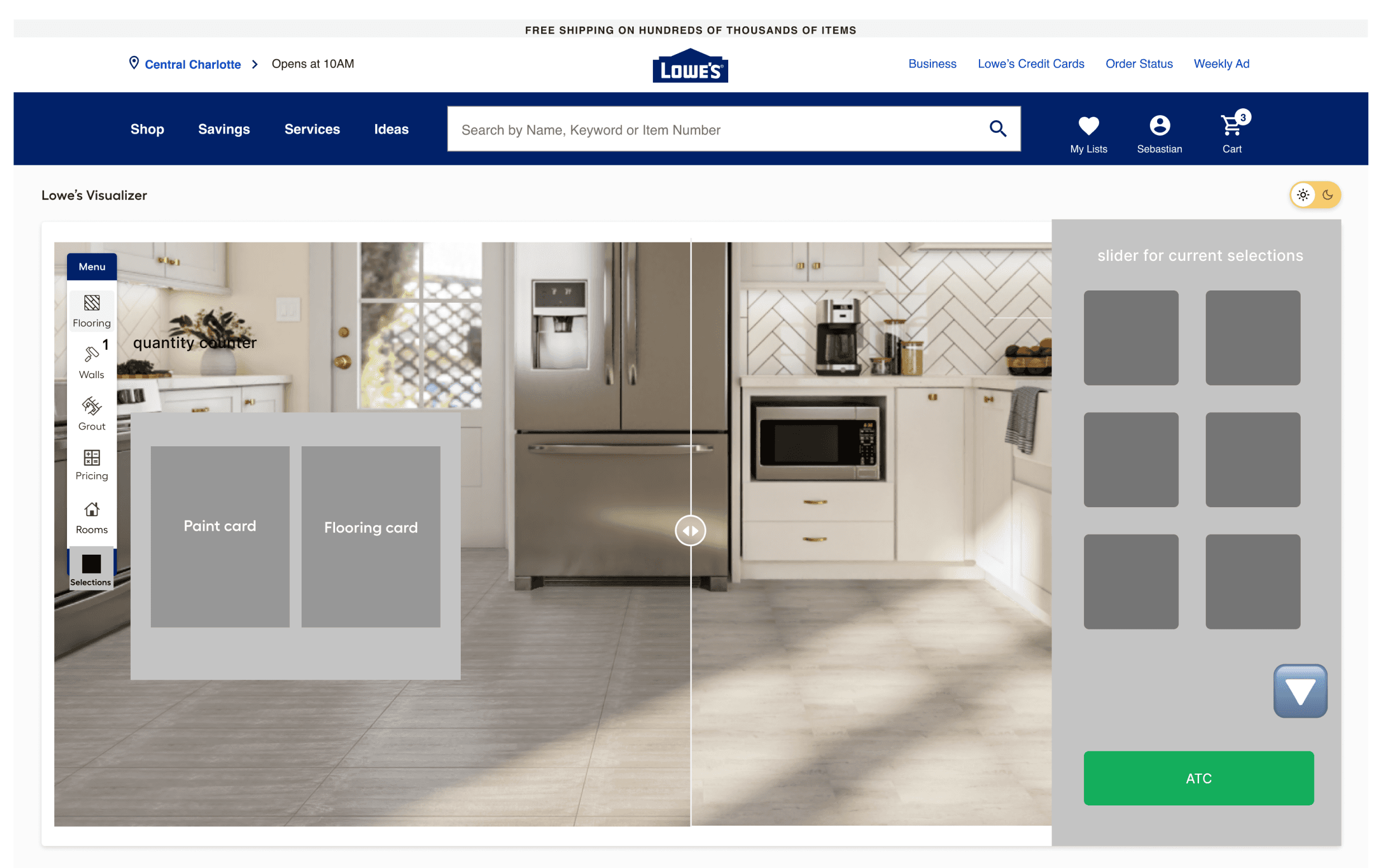
⬆️ This interaction utilizes a strong design pattern on Lowes.com — the slider to ATC.
Concept 4

⬆️ Part of this exploration also wouldn’t scale well, and wouldn’t work when someone moves the slider over to populate more of one color choice in the entire room. However, there is an element that would have worked well with multiple products — clicking on a swatch would highlight the desired product inside the room to clarify what products people would like to keep considering when the room got full.
Concept 5

⬆️ The icons' intent was to add stability and context to the experience, especially for mobile.
Accessibility & readability enhancements
Floor measurement challenge

While ceramic and carpet flooring is sold by the square foot, laminate flooring is sold in rolls by Linear foot.
Since every product is packaged uniquely, offering a calculator for Linear foot flooring wasn't technically feasible like we did for Square foot flooring. This solution wasn’t the best, but it offered an answer to how a person can calculate what they need.
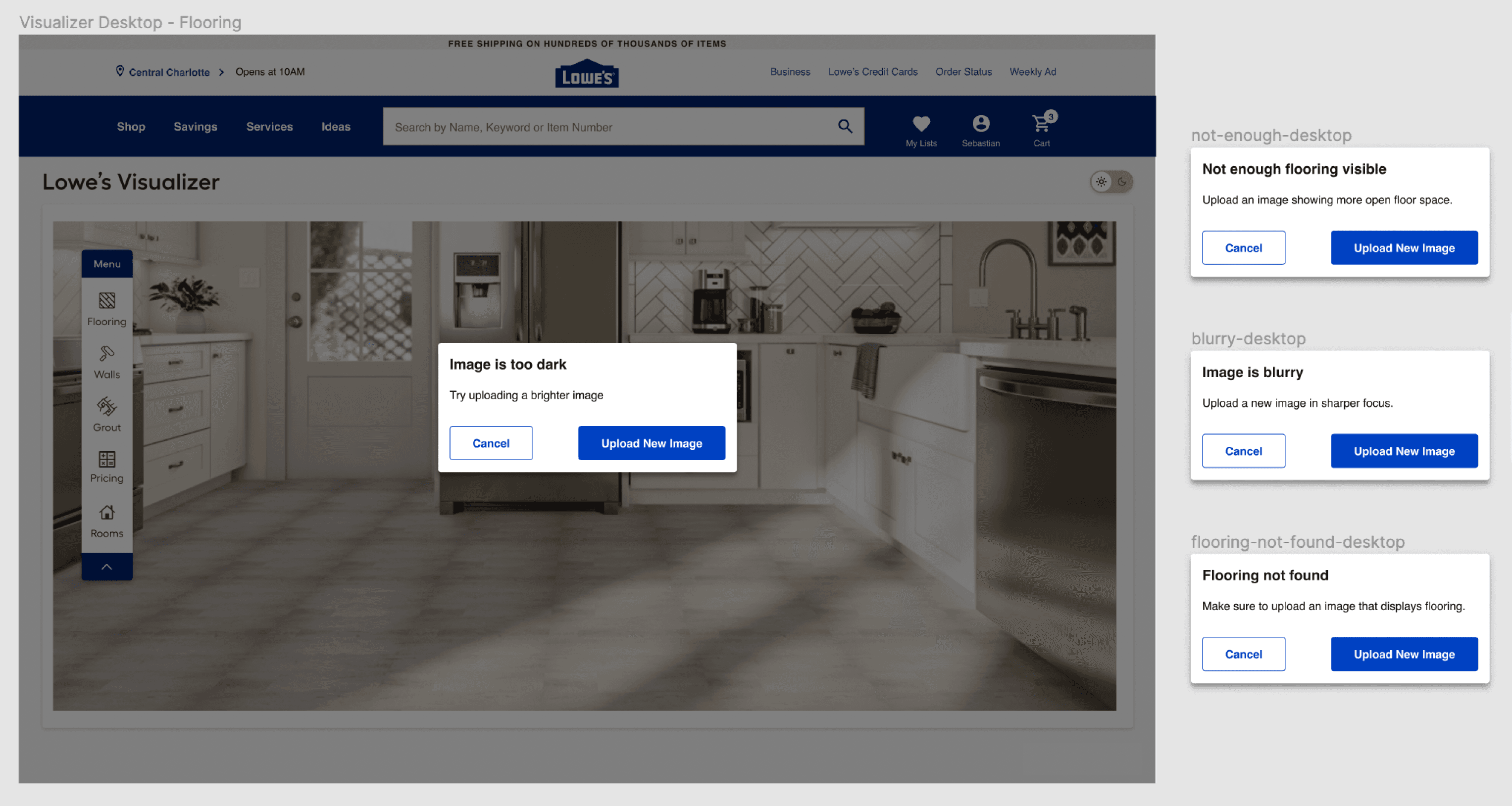
AI image recognition and customized error messages:
Why won't my image upload?
After a customer uploads their image to Visualizer, our system analyzes it to recognize flooring.
Conversions to visualizer
Once people enter Visualizer, conversions skyrocket. But not enough people are getting there. How can we help users understand that Visualizer is a 3-dimensional room design experience and encourage them to use it?
Branding the experience with an icon

Offering a preview animation to show users what’ll happen once they click ‘See it in the Lowe’s Visualizer”

Clear CTAs

More projects
Let's work together! 🚀


