
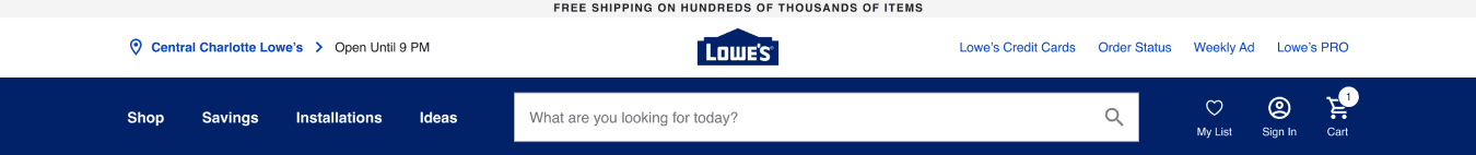
Lowe’s Navigation
I lead Lowes.com through strategy and research for a Masthead redesign as we parsed through user feedback and data directed at a legitimate problem but an inaccurate source.
💼 “Customers say our navigation sucks. Ask the UX/UI team to remove {abc and def 🔒} and put {ghi and jkl} things to the Masthead.”
UX Goals:
Find out what it is about our Masthead/Navigation that customers “hate” and discover opportunities to improve our customers' experience in getting to their desired end product.
Make sure that we don’t create new and bigger customers problems by ‘solving’ current ones based on business assumptions without validating what’s important to Lowe’s customers.
Align with multiple Product and UX leads across of all of Lowes.com that are affected by Masthead and product discovery and interaction - like Filters and Fulfillment.

My core contributions:
Greater focus on the customer: Conversations and workshops with partners to understand their objectives from a customer's perspective.
Advocating for tool access: While Lowe’s had all the tools needed, they were gated off from the UX team. Once we successfully advocated for granted access, we returned to the fundamentals of observational research and unlocked the problems more efficiently.
Priority setting for problems: Rather than tackling every problem, we stack ranked the site's navigational issues against known product flaws -as reported by our customers.
Product, Business, and Marketing Goals and hypotheses:
Customers convert 3% more when they’ve interacted with the Shop menu at least once during their shopping visit. But customers aren’t interacting with Masthead to find products - so there is an opportunity to increase revenue by improving the Masthead navigation experience.
If we increase the size of the Masthead, we can expose more L-2 categories so that people will see and interact with them more.
By increasing the size of the Masthead, we can fit more seasonal promotions and opportunities and increase revenue from deal-savvy shoppers.
By increasing the size of Masthead, we can fit a ‘Notification Center’ that will help notify customers of different opportunities (to be developed)
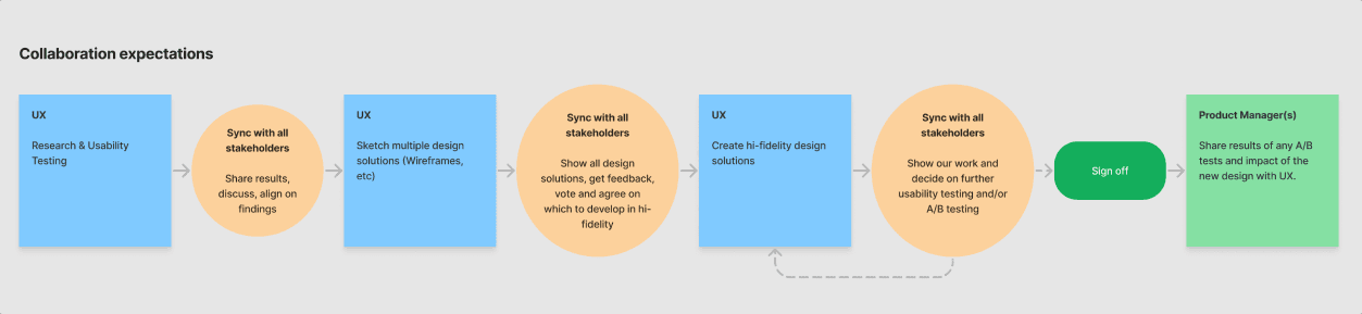
My alignment process:
Many of the partners we worked with on this project had seldom, if ever, worked directly with UX partners on feature planning. We led project discovery workshops which offered visibility and transparency to our UX process and opened the gate for productive and effective collaboration between business, product, and design partners. We did a lot of critical thinking together to show why we need to understand the Why behind every ask for customers so that we can design the best experience and get to the final, visual deliverable.
Lowe’s UX Process
I shared an (🔒 NDA-locked) infographic highlighting each step in our UX Process for net new and incremental design initiatives.
A loose summary of the process:
Understanding ➡️ Research ➡️ Information Architecture ➡️ Wireframes ➡️ Mock-Ups ➡️ Evaluate & Validate
What we need to kick off any new UX initiative
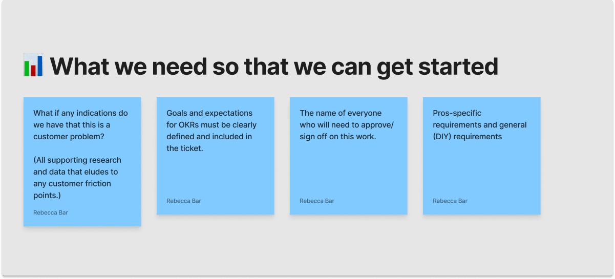
Why we need it - what are we going to use the information for?

Fundamental Cross-functional collaboration
Timeline I offered for UX Discovery & Validation:
July 4-8th:
Competitive Navigation Search Task Unmoderated – Administration of the test (UX Researcher 1) 4 Tests
Lowes.com Navigation Search Task Unmoderated - Administration of the test (UX Researcher 2) 4 Tests
Feedback from Medallia & Full story Analysis (UX Researcher 2, UX Project Lead)
Feedback Analysis shows some varied results. (we’ll review in the update meeting.)
Design Discovery Document (UX Project Lead)
July 11-15th:
Review Research Updates with greater team and show trends. Team update
Competitive Navigation Search Task Unmoderated – Analysis & Report (UX Researcher 1) 4 Tests
Lowes.com Navigation Search Task Unmoderated – Analysis & Report (UX Researcher 2) 4 Tests
Search Terms Analysis – (UX Researcher 2)
July 25-29th:
Competitive Navigation Search Task Unmoderated – Read Out (UX Researcher 1) 4 Tests
Lowes.com Navigation Search Task Unmoderated – Read Out (UX Researcher 2) 4 Tests
Trend Identification and Themes for updating.
🔎 After parsing through and color-coding thousands of customer feedback mentioning anything search, navigation, or masthead-related, and watching customer interaction recordings with Masthead for all yellow, or Masthead specific feedback, we discovered that:
Customers are not using the word “Navigation” to describe friction with our Masthead.
There are indeed significant issues with product find-ability, some of the top customer complaints are:
Site performance issues. (We can help fix this, and we should.)
Fulfillment issues.Confusion with our filters on PLP/SLP
Difficulty finding non-product related information on the masthead (Services, order info, contact info, veteran discount, etc)
Based on our research and testing, we offered a ‘roadmap’ for work that would provide exponentially better Product Find-ability for Lowe’s customers. This cannot be prescriptive or copied from other sites, because we base our work on research with our customers' needs and our unique challenges – technical or otherwise.
Opportunities for Masthead:
(Based on user testing, customer feedback, and Baymard’s recent audit for Lowes.com)
🚨 “Highlight current scope in the Main Navigation.” -- breadcrumbs are meant to achieve this but customers are blind to them because we are overwhelming them with many other things they see as irrelevant and that cause friction to their search. (See “Aesthetic and Minimalistic Design”)
We saw enough feedback in Medallia that could validate this design work specifically on offering customers SCOPE of where they are, (especially when coupled with site performance improvements.)
💡 Opportunities to improve on the problems customers have finding products on Lowes.com:
🚨 Site performance issues - critical:
We recommend a full site audit specifically on page performance. UX as a discipline can help facilitate this – our job is just as much to design the way things work than it is the way they look.
🚨 Communicate customer difficulties with filters Filter Product Lead:
Customers can’t easily see what's in stock, information that is 'make it or break it' for Lowe's customers when deciding to or not to make a purchase.
🚨 Communicate to Fulfillment team:
Customers don’t know how to find Lost Orders and other information they’d typically ask the front desk at a physical store.
🚨 Inconsistencies with products that are in-stock that really aren’t: The site shares data that is incongruent with the in-store stock.
Gallery of initial concepts for exposing more categories


More projects


Let's work together! 🚀