HOSPITAL PATIENT VIDEO MONITORING SOFTWARE - 2019
Six hospital patients click on their bedside call button for care and attention. There are only two nurses on call. Who do they go to help first?
We built Caresight’s video monitoring software to help understaffed, high-stress hospital nurses make tough decisions on the fly.
Disciplines applied:
Mentorship for a Jr. Design team | UX Research | UX Design | UI / Design Systems

Our primary initiative was to simplify a hospital set-up process for high cognitive load / split attention hospital nurses and health care administrators.
Together with a Jr. Design team, I redesigned CarePoints confusing four-screen flow with multiple error messages and redirects to a one-screen solution for adding and editing hospital floors and rooms.
Core contributions
Back to effective UX processes: I moved the Jr. design team away from the hi-fidelity work they were doing back to start with understanding our users’ workflows so that we could create a usable and effective solution.
Design team coaching: I encouraged and coached our junior designers to present their work and articulate the "why" in their design decisions to our Product Managers.
UX writing: I added search + input suggestions in each table and search field so that nurses wouldn't need to think about what information they might want to input for future reference.
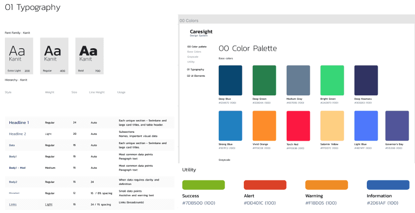
Caresight’s design system we inherited had many archaic components that we didn't need and copied and pasted from previous libraries (some pixelated.) We led the team through a clean-up and update of Caresight's design system.
We implemented a cleaner 8px grid and increased table row height to 64px to accommodate text wraps.
RESULTS: We redesigned CarePoints confusing four-screen flow with multiple error messages and redirects to a one-screen solution for adding and editing hospital floors and rooms.

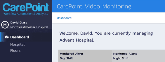
⬆️ Screenshot of an early dashboard wireframe for Healthcare Admins.
The setup process
Caresight's video monitoring software is useless if the setup process isn't done right. It's critical that nurses and healthcare admins understand what information to inout so they can later navigate between hospitals, floors, rooms, and patients, and read their data.
The biggest problem we had to solve initially was to present the parent-child relationship of healthcare groups / hospitals / floors / rooms - and why this was important to each of our users’ workflow.
A new hospital cannot be created or edited before it’s parent healthcare group is chosen. A floor cannot be chosen, added, or edited until the user chooses a hospital. The same goes for rooms to floors and patients to rooms.
We wanted to solve this problem without resorting to error messages.
After exploring different paths to complete setup that were too long and not intuitive enough, like:
* A Wizard Nav explaining the parent-child relationships
* An Infographic demonstrating the navigation steps
*Adding quantity numbers to each parent in the left-rail
*Making items in the left-rail hover-able to show drop-down allowing the user to choose all relationships at once
*A right-panel modal that appears when user clicks on a child relationship too soon, prompting them to choose the proper parent relationships first.
We landed on a solution that consolidated four screens in a flow to one seamless, intuitive screen that makes the setup process quick and easy and was met with relief and delight during testing.

BEFORE
4 Screens and a broken flow for adding or editing a floor and/or a room to the system

AFTER - SOLUTION
One, intuitive screen for editing and/or adding all floors and rooms

Caresight needed a solution that would work for three levels of software access and different data needs:
Nurses
Healthcare Admins
Sys admins
Apart from solving the larger and more persistent challenge of simplifying the flow users need to set up and edit hospital floors and rooms, I also revised the microcopy and UI throughout the product to better the overall user experience.
(ux) writing gallery
Clear input fields:
Nurses: “What information is expected of me to input to describe a patient?

Nurses: “What words should I use to search for what I need?”
Healthcare administrators: “I just got back from my lunch break. Which hospital was I logged into?””

Let’s not assume someone knows how to use our software but forgot. Rather, let’s use helpful and friendly prompts.

Design system gallery

⬆️ Revised UI components for Carepoint
UI CHANGES WE MADE
We were working with a basic design system, but made some core and scalable changes that can grow with Carepoint.
We moved to a cleaner 8px grid
Adjusted text sizes and weights to reflect the 8px grid and the new information architecture
We gave the tables more space, adding a relaxed row height of 64px high to accommodate text wraps
Moved from grey background to white for tables
Tested and changed UI colors for accessibility
Doubled on UI communication - for example, changed micro-text to reflect error color as well.
Made sure iconography was consistent and export-ready for the development team.
More projects
Let's work together! 🚀


