
NEW 3-D INTERACTIVE PARK MAP
This work was done by me for Chaos Theory Studios for their end client, Universal Destinations and Experiences.
One of the challenges I faced with designing Universal's new interactive Park map was to create a map that would accommodate guests with different intents - those planning their trip on their home laptop or desktop on the web and then inside the park on the mobile app -- to find attractions, dining, shows, restrooms and their general way around.

Where we started: (Pre-design)
Hollywood, CA: (Pre-design)

Orlando, FL: (Pre-design)

Osaka, Japan: (Pre-design)

Understanding guest needs
In addition to rigorous usability testing, I set out to understand how people solve their trip-planning challenges today using observational methods, like Universal trip-planning Facebook groups, as one point for anthropological research.
Some key learnings:
Park-goers need a perception of scale for the size of the parks and themed lands.
How granular people want to get into the pre-park planning stages with showtimes and opening times for different rides.
Guests want to understand park entry access from the Universal Resorts from the map.
How people were going out of their way to buy a physical copy of the map, and how critical it would be that the new digital map mirror the tangible map experience as much as possible.
What information is important for guests to see on a ride or attraction while planning their trip at home?
Heuristic analysis
After synthesizing new and older research to understand guest pain points completely, we broke down our priorities for the new map into these core UX principles:
Visibility of systems status - We needed to prioritize map loading time so people could use the filters and see the map updating in real-time.
Jakob’s Law - Most users spend time on other map and way-finding apps. We did a deep comparative analysis of core products people use in their day-to-day lives so that we could design a map that is intuitive to use with easily recognizable design patterns.
User Control and Freedom - Universal’s legacy map view lacked depth and reference points to help guests understand where they are in relation to where they need to go. This map needed to be more interactive and in sync with the brand’s core storytelling aspects and slogans - like “Ride the Movies” and “Let Yourself Woah!”
Recognition rather than recall - We needed to provide guests with clear and conventional signifiers to direct guests’ attention to helpful tools.
🗣️ “Hello, I’m trying to plan an itinerary for our upcoming trip in 3 weeks. While looking at rides on the map, it seems like different rides open at different times in the morning. Is this the case? Some open at 9 am, some at 8 and some even at 10. Thank you!”
🗣️ “I googled it and then printed a large version of the map from my computer at home. It was nice because I could make notes and circle things we wanted to see and do.”
🗣️ “Before I went, I actually bought a couple of maps on eBay so I could look at them. I prefer paper maps over the apps myself.”
🗣️ “Thanks everyone! The maps don’t even have the resort names, unless I’m missing something. For someone who has never been, it’s challenging!”
🗣️ “Is there an online map that shows resorts and parks? I’ve never been and the app only shows the park, no idea how we will enter via our resort. Thanks!”
🗣️ “I’m looking for a park map of Universal overlaid on a map of Magic Kingdom (or any Disney park) so that I can get an idea of the size, since I know Disney parks well and don’t know Universal. Does anybody know where I could find something like that? ”
The results
Key elements of the redesign:
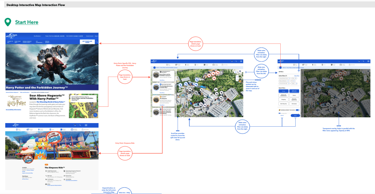
🌟 I replaced the breadcrumbs with a floating backlink navigational element, treating the Map as a 3-dimensional experience that stands on its own, making it more interactive and delightful to use. The back icon is the same color as the Masthead which indicates that it’s a navigational element for the website rather than a map control.
🌟 I placed all controls that manipulate the map on the map itself, to remove any cognitive load in regards to all the clickable options on the page.
🌟 The POI card component is a translucent overlay on which the POI cards sit. The benefit and design rationale of the translucent overlay was that when guests can see that the map continues underneath the component, the map's interactivity will be more apparent to them.
🌟 The desktop experience has a scrollbar that should default to the scrollbar UI and interactions native to the user’s operating system.
Design Intent
Our solution allows guests to easily plan their day and understand what is offered in a given land (points of interest) before they visit the park.
Land Strategy:
The new Global Design System map pins are colored to represent different attractions' locations within Universal Park lands. (For example, The Wizarding World of Harry Potter™, Jurassic World™, Springfield™, etc.) We saw an opportunity to strengthen Universal Land branding and design communication in the POI cards by matching the stroke around the attraction image and the map pin icon next to the land header with its corresponding pin on the map.

Design Rationale
The new design solution will strengthen a user’s sense of visibility and where they are in relation to their chosen POI, including nearby POIs. I used map design patterns that support recognition rather than recall. Adaptive states and async tools will ease the delay in displaying important information. Users will have control and freedom over their Interactive Map experience. Guests receive immediate responses that will help them achieve their goals using the map feature.
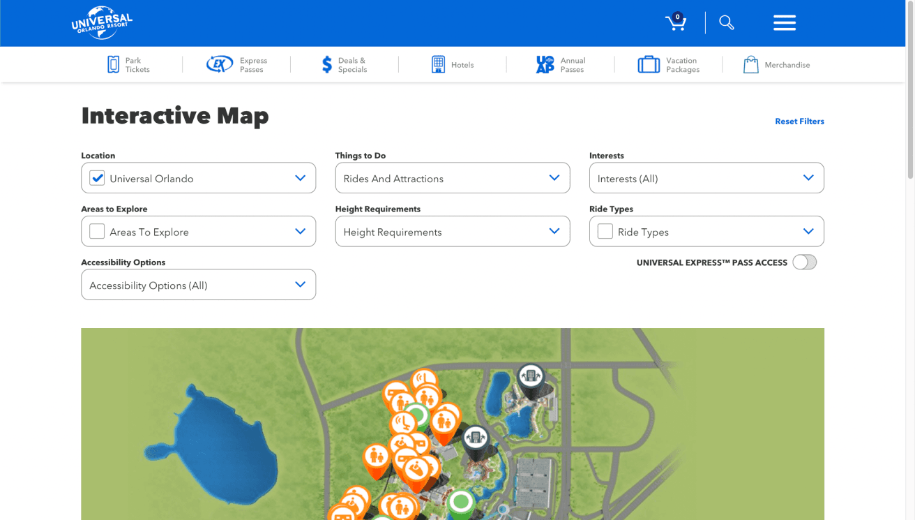
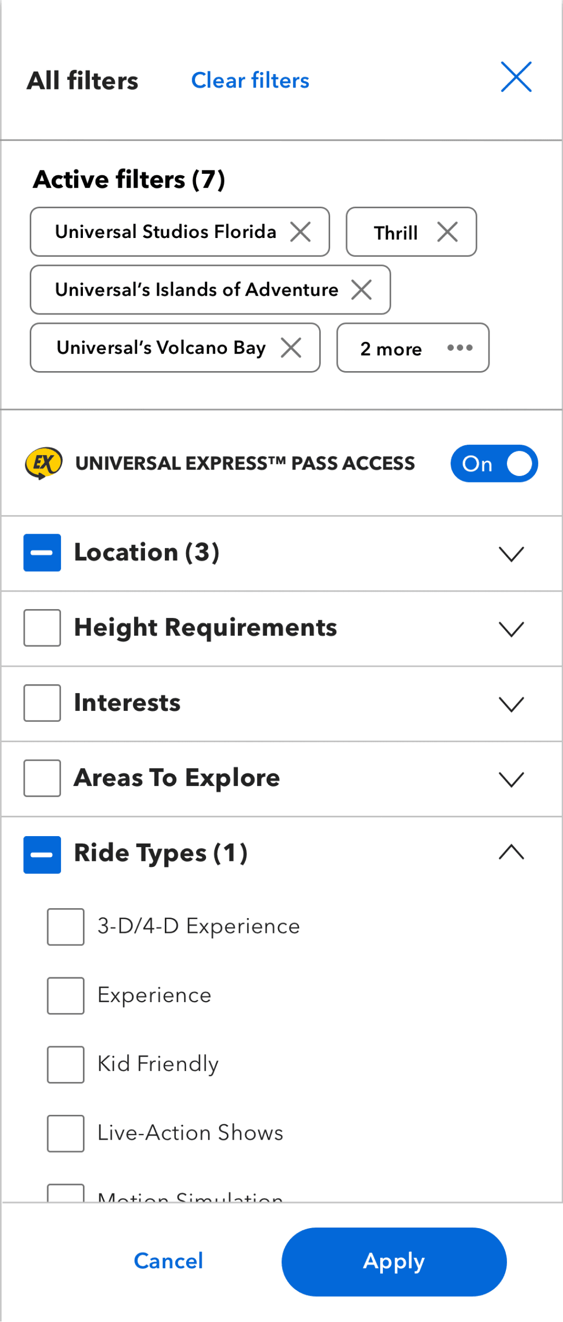
Filters
By eliminating some and replacing other clickable elements, we expanded the map size on a guests screen exponentially on Mobile and Desktop, making it more interactive and accessible for people to use - and is more reminiscent of the physical park map people know and love.
We used an e-commerce design pattern for the filters so they aren’t immediately covering the map experience and so that guests can intuitively understand how the map will update in real time.
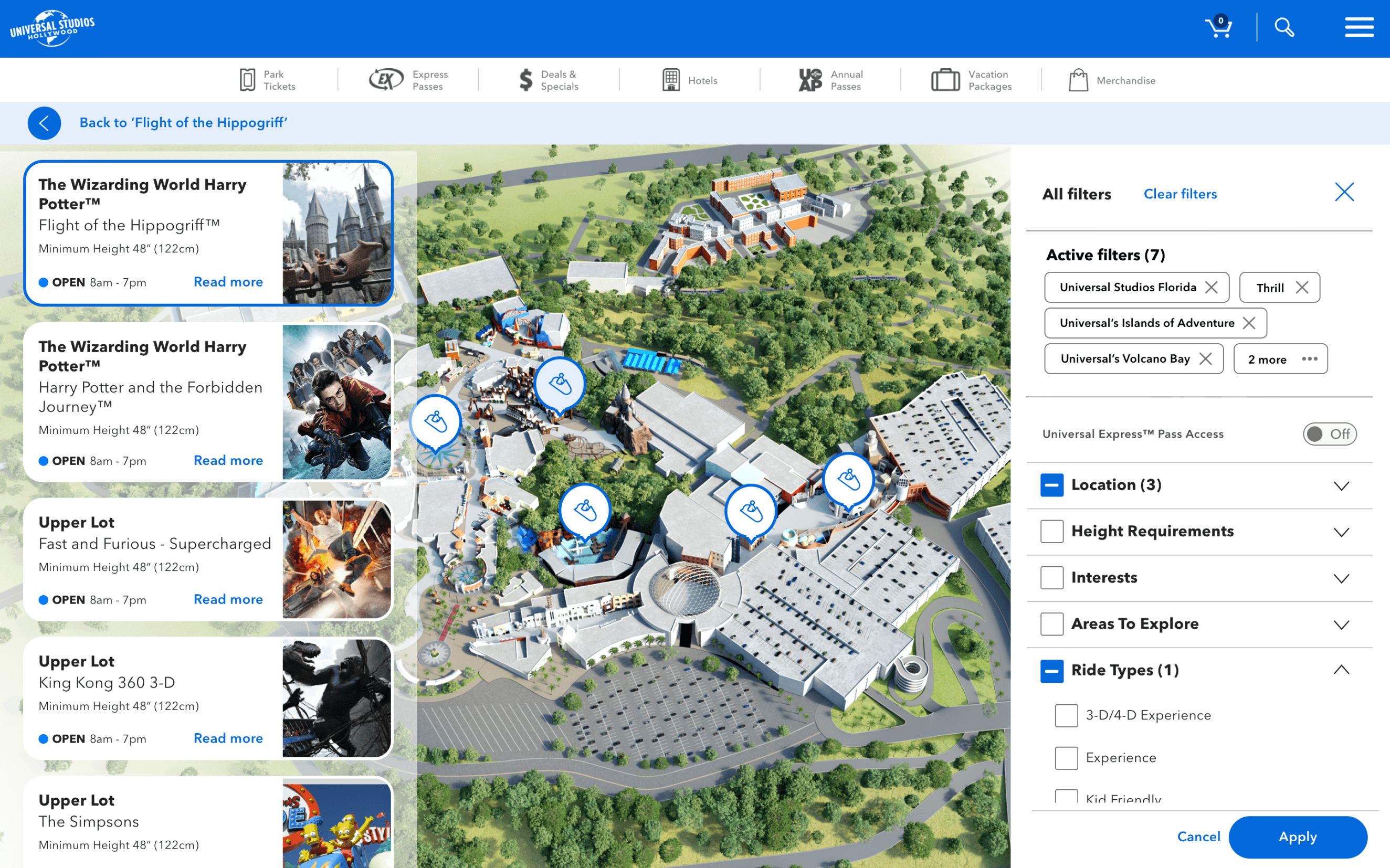
POI - Point of Interest Card - that would immediately show guests the information they needed at their trip planning stage.

Other - Gallery


More projects


Let's work together! 🚀