
Why are so many customers searching for products and bouncing of our results pages before clicking on any of our products?
By breaking down our customers’ shopping journeys and understanding what they want to see, when and where, I increased product find-ability.
Disciplines applied:
UX Research | UX Strategy | Content Strategy | Information architecture | UX design
Core Contributions
- Multi-disciplinary and cross-functional collaboration: I worked with researchers from multiple team verticals to measure the value of different recommendations, product education modules, and marketing/brand banners during different parts of our customers’ journey.
- Alignment workshops: I created visual assets and research documents and led workshops to help align Product, Business & Marketing teams to a user-centered approach of focusing on customers’ intent when shopping our PL/SL pages.
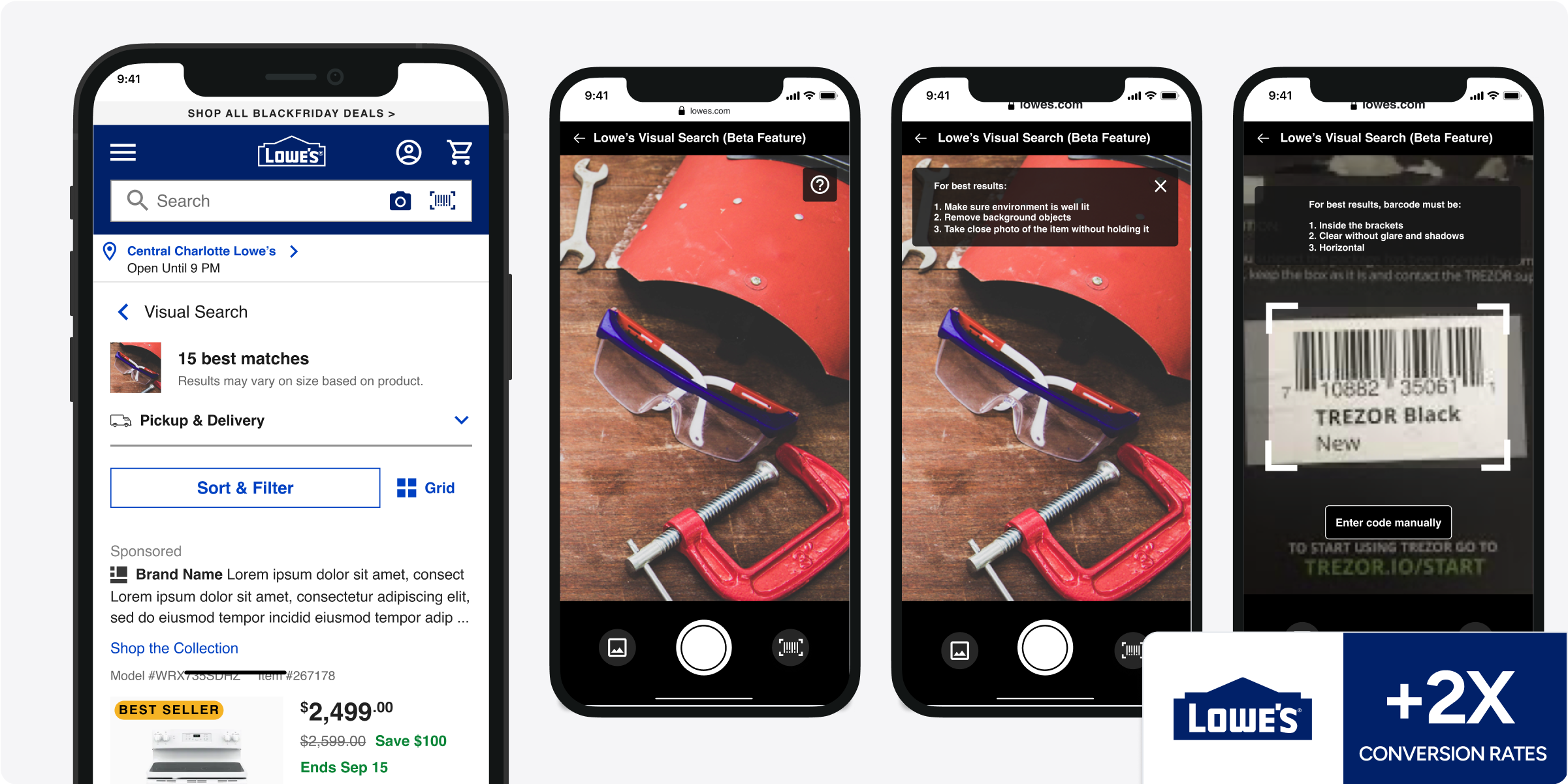
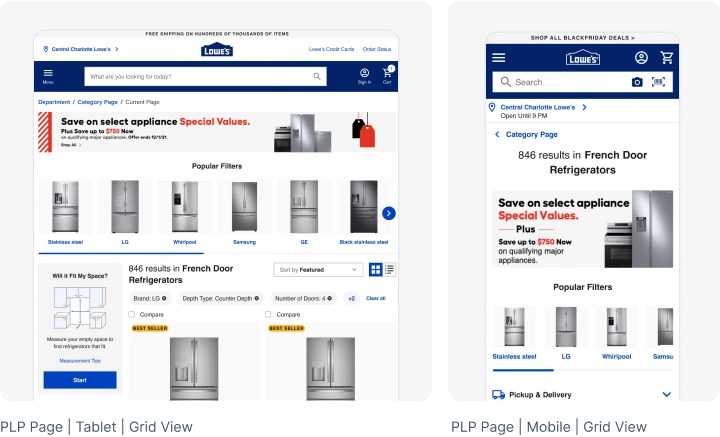
- Mobile-first: I advocated testing a unique mobile solution that didn’t need to resemble our desktop experience 1:1 but stand on its own.
Some changes we made
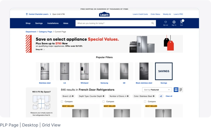
- Collaboration with Marketing: I worked closely with the marketing team to significantly reduce banner sizes while still allowing enough space for their content.
- Testing customers’ “ready to buy” points and timing: I tested different recommendation carousels to understand which are helpful and welcome to Lowe’s customers on a Product / Search listing results page, where our pages come into place to help customers convert their buy intent into action.
- Page Loading Performance: I also dove into which carousel algorithms are affecting page loading times and performance – as this was an enormous Lowe’s customer pain point, especially on PLP/SLPs.
- Conversational Design: I aimed to mirror a Lowe’s human in-store shopping experience when designing the digital one. Product discovery for DIY Lowe’s customers happens when they can ask an expert for help and be pointed to the product they need – without upselling or distracting them with other things.
- Readability: We changed text alignments and their placements on the page to increase readability and decrease vertical space to get to Product results
Results
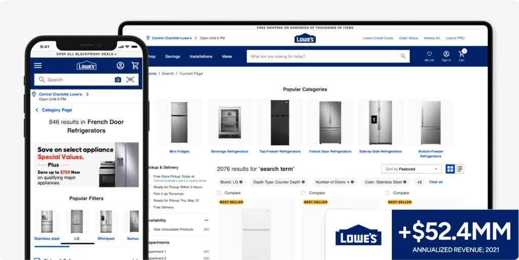
By reordering the taxonomy and hierarchy of information (while removing others) at the top of search and product listing pages, we immediately decreased bounce rates and increased conversions – driving 53.4MM in additional annualized revenue in 2021.